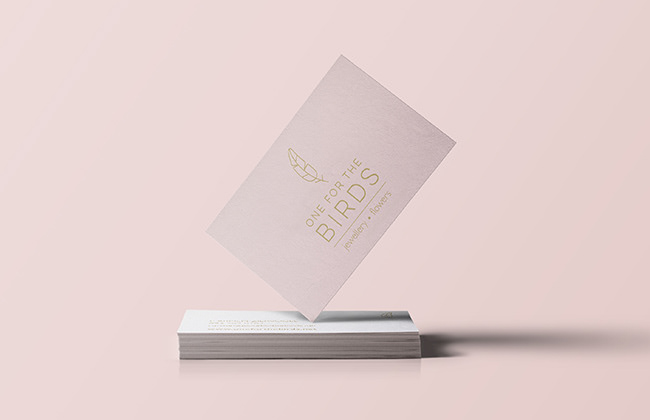
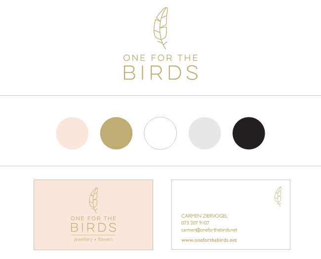
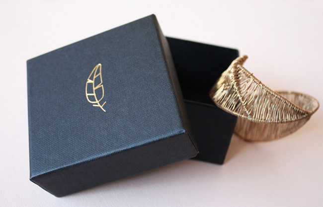
One for the Birds is the brain child of award winning illustrator and designer Carmen Ziervogel. She asked us to collaborate with her to develop the identity and packaging for her new jewellery range.
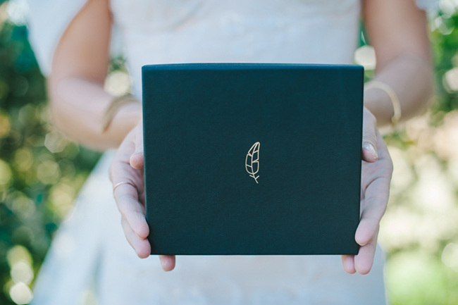
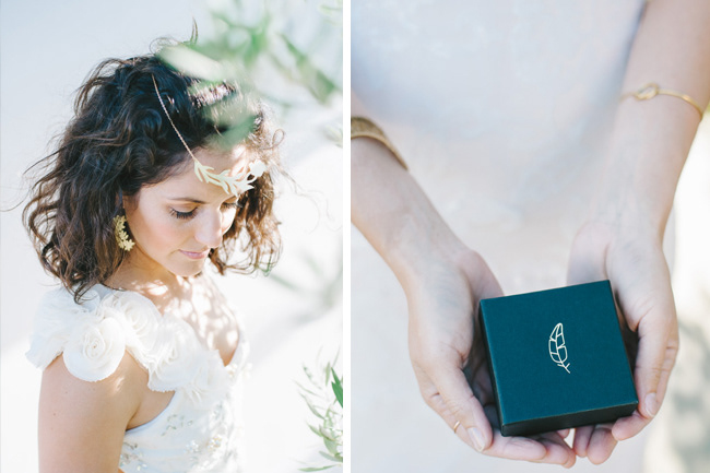
Carmen had a very clear idea of the styling she wanted for her brand. “Natural, simple, clean lines and sophisticated” are the words she used. Regarding tones, as most her jewellery is gold, we decided to use this as the main colour and of course all the packaging has gold foiling. We used soft peach, black and white as secondary colours and a feather as the brand symbol.
Services: Logo Design, Packaging, Art Direction